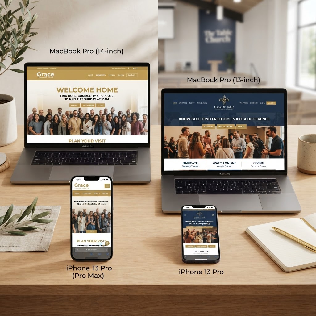
Looking at the best church websites for design inspiration is one of the smartest ways to start a new church website project. Whether you're redesigning your current site or building from scratch, studying what the most effective churches are doing right helps you avoid costly mistakes and create a digital front door that actually welcomes visitors.
We analyzed hundreds of church websites to find the ones that stand out — not just for beautiful design, but for usability, mobile experience, ministry integration, and how effectively they guide first-time visitors toward a next step. Below are the 10 best church websites in 2026 and exactly what makes each one great.
The best church websites aren't just pretty. They're strategically designed to help a first-time visitor find what they need in under 10 seconds — service times, location, how to watch online, and how to take a next step.
What Makes a Great Church Website?
Before we dive into the examples, here's what the best church websites all have in common:
- Clear next steps: Navigation that answers "I'm new, what do I do?" immediately
- People-centered imagery: Authentic photos of real congregation members, not stock models
- Mobile-first design: Over 70% of visitors view church sites on their phone
- Latest sermon front and center: Easy access to watch or listen within one click
- Online giving integration: A frictionless, secure giving experience
- ADA accessibility: WCAG-compliant design that serves every visitor
- Fast load times: Pages that load in under 2 seconds
1. Mariners Church
Website: marinerschurch.org
Mariners Church has a beautiful, people-centered website that helps visitors know exactly how to take a next step and strongly communicates their church culture from the moment the page loads.
What makes it great:
- Homepage has easy-to-find next steps in navigation (locations, watch, volunteer, give)
- Homepage content leads with an easy-to-play "latest sermon"
- Displays real Instagram content to show authentic church life
- People-centered images throughout — not a single stock photo visible
- Smooth motion transitions that guide the eye without being distracting
- Navigation expands to full-screen view for easy browsing between pages
2. iTown Church
Website: itownchurch.com
iTown Church has a modern, minimalist style with great video integration and people-centered imagery. The entire site is focused on helping visitors take a next step toward experiencing a service.
What makes it great:
- Homepage has clear next steps in navigation (watch, visit, grow, give)
- Homepage content leads with a call to action to experience a Sunday service
- People-centered images throughout that feel authentic and welcoming
- Large open spaces create a clean, calming feel that doesn't overwhelm
- Video content is seamlessly integrated, not an afterthought
3. The Village Church
Website: thevillagechurch.net
The Village Church has a modern, easy-to-navigate website that provides a lot of content without feeling cluttered or overwhelming. Their use of people-centered imagery throughout makes the site feel both welcoming and trustworthy.
What makes it great:
- Homepage has easy-to-find next steps in navigation (new here?, give, login)
- Homepage content leads with a call to action to worship online or register kids for in-person services
- People-centered images throughout create a welcoming atmosphere
- Mobile app is prominently promoted on the homepage
- Excellent use of brand colors throughout the site and in imagery
4. Summit Church
Website: summitchurch.com
Summit Church has a beautifully designed website with a modern feel, using only a few brand colors and strategically placing navigation and calls to action throughout. It's a masterclass in visual restraint.
What makes it great:
- Homepage has easy-to-find next steps in navigation (I'm new, learn more, connect, give, login)
- Homepage content leads with calls to action to engage in the latest initiative, find a location, or create an account
- People-centered imagery throughout
- Mobile app promoted on the homepage
- Restrained color palette creates a cohesive, premium feel
5. Brentwood Baptist Church
Website: brentwood.church
Brentwood Baptist Church has a very mobile-friendly design with a minimal but effective homepage that is focused on helping visitors take a next step. The site proves that less truly is more.
What makes it great:
- Homepage has easy-to-find next steps in navigation (new here, connect, watch/read, give)
- Homepage content leads with calls to action to join a group or register for the latest event
- People-centered imagery throughout
- Minimalist homepage loads fast and works perfectly on mobile
6. Austin Ridge Bible Church
Website: austinridge.org
Austin Ridge Bible Church is a great example of a multisite church website done right. With beautiful photos and a clean, modern design, it communicates a sense of calm, community, and stability.
What makes it great:
- Homepage has easy-to-find next steps in navigation menus
- Homepage content leads with a single, clear call to action to "Learn More"
- People-centered images throughout
- Dual navigation menus: Main Menu and Ministries Menu — handles complexity elegantly
- Campus switcher makes multisite navigation effortless
7. Elevation Church
Website: elevationchurch.org
Elevation Church has a very modern and mobile-friendly website that is user-focused and easy to navigate. Their use of colorful, engaging people-centered photos on top of simple white and gray backgrounds creates visual interest that helps the visitor engage.
What makes it great:
- Beautiful photography that contrasts well on light gray pages
- Homepage has easy-to-find next steps
- Homepage content leads with a single call to action to watch the latest sermon
- People-centered images throughout
- Well-executed navigation menus that work seamlessly on mobile
8. Bayhope Church
Website: bayhope.church
Bayhope Church has a fun, modern, and mobile-friendly website that is user-focused and easy to navigate. Their use of colorful graphics, hand-drawn elements, and engaging people-centered photos creates visual interest that appeals to all ages.
What makes it great:
- Beautiful photography that contrasts well on light-colored pages
- Hand-drawn elements give feelings of approachability and fun (very Gen Z focused)
- Homepage has easy-to-find next steps
- People-centered images throughout
- Well-executed navigation menus
- Well-designed and engaging popups that don't feel intrusive
9. Sadie Robertson Huff's Church Inspiration
Trend: Many of the fastest-growing churches in 2026 are blending bold typography, video backgrounds, and minimalist navigation to create an immersive first impression.
What makes this trend great:
- Full-screen video backgrounds create an emotional connection instantly
- Bold, large typography communicates the church's mission in one glance
- Minimalist navigation reduces decision fatigue for first-time visitors
- Storytelling-driven content that makes visitors feel something before they read anything
10. MyChurch-Built Church Websites
Website: mypocketchurch.com/portfolio
We'd be remiss not to mention the 200+ church websites we've built at MyChurch. Our portfolio includes sites for congregations of every size — from church plants to multisite megachurches — all designed to get found on Google, look credible, and convert visitors into guests.
What makes them great:
- Custom-designed — never a template, always tailored to your church's brand
- SEO-optimized with structured data, local SEO, and keyword-targeted content
- ADA-compliant by design — accessible code and compliance monitoring
- Integrated with church mobile apps, AI chatbots, and online giving
- Ongoing management, updates, and support — never set-and-forget
See real examples in our church website portfolio or learn about our church website design service.
Key Design Takeaways From the Best Church Websites
After studying these sites, here are the patterns that separate the best from the rest:
- Next steps are always visible: "I'm new," "Watch," "Give," and "Plan a visit" appear in every navigation bar
- Real people, not stock photos: The best sites invest in professional photography of their actual congregation
- One primary call to action: The homepage leads with one clear next step, not ten competing ones
- Mobile experience is flawless: Navigation, video, and giving all work perfectly on a phone
- Sermon media is front and center: The latest message is always one click away
- Brand consistency: Colors, fonts, and imagery are cohesive across every page
How to Build a Church Website This Good
You don't need a megachurch budget to have a website this effective. The secret isn't flashy design — it's strategic design. Every element should serve one of three purposes: help a visitor find you, help them trust you, or help them take a next step.
If you're comparing website builders, read our guide to the best church website builders. If you want a custom site built and managed for you, book a free consultation — we'll show you how affordable a world-class church website can be.
Frequently Asked Questions About Church Websites
What makes a good church website?
A good church website is mobile-first, loads fast, answers a first-time visitor's questions in under 10 seconds (service times, location, what to expect), features authentic people-centered photography, prominently displays the latest sermon, includes easy online giving, and is ADA accessible. The best church websites also rank well on Google for local search terms.
How much does a good church website cost?
A good church website costs anywhere from $17/month for a DIY builder like Wix to $249–$449/month for a fully custom, managed website from a specialized church website agency. The real cost question is total cost of ownership — including your time, hosting, plugins, security, and updates. See our guide on church website costs for a full breakdown.
Should a church website have a mobile app?
Yes — the best church websites promote their mobile app on the homepage. A website attracts new visitors; an app engages existing members. They work together. A church app provides push notifications, sermon audio, giving, and daily engagement that a website alone can't deliver. Learn about church mobile apps or read about the best church apps in 2026.
What should be on a church website homepage?
A church website homepage should include: a clear welcome message, service times and locations, a "I'm new" or "Plan a visit" call to action, the latest sermon embedded or linked, online giving button, navigation to key pages (about, events, sermons, give, contact), authentic photos of your congregation, and a mobile app promotion. Keep it simple — one primary call to action per section.
Ready to Transform Your Church's Digital Presence?
Schedule a free consultation with our ministry technology experts and discover how a custom church app or AI-powered tools can grow your congregation.
Book Consultation →